Special collections' design process
The visualization we developed for the Network of Libraries of the Bank of the Republic of Colombia is a web tool that allows users to create their own search paths through the special documents and collections available in the libraries. This project took around 6 months of work, form initial research and sketching to the final product that is currently in use. It gave us a unique opportunity to apply novel frameworks and technologies for web development such as p5.js to make the rich cultural heritage deposited at the Network of Libraries more easily accessible to a wide range of users, from ocassional visitors to expert researchers. This post shows some of the visual materials and concepts that inspired the tool, as well as design sketches and prototypes.

Background
The Network of Libraries of the Bank of the Republic is the depository of more than thirty-five historical archives that constitute a primary source for the reconstruction of the history of Colombia. Researchers and historians can consult most of these archives in the Room of Rare Books and Manuscripts of the Luis Ángel Arango Library; however, some of these archives are available at other cultural centers of the Bank of the Republic around the country.
When we started working on this project, several of the materials were available in digital through a web portal where the information was organized in various thematic groupings and by document types. Analysis of this portal revealed the following features:
- Most of the data had already been digitized
- A fraction of the contents were available through a “pre-made” timeline visualization implemented with an existing javascript library.
- Another part of the contents were available through different interfaces (list, maps, etc)
- There was little connection between all the contents, each topic had to be visualized within its own separate page
The major aims of the interactive visualization to be developed were the following:
- to gives a more holistic access to the contents of the site
- to emphasize relationships between separate themes and types of materials, and facilitate finding contents and understanding the context of these contents
Time-based data
As the special documents and collections had a strong temporal dimension, and timelines were used in the original version of the website, we started exploring timeline-based visualizations of the data. The slideshow below contains some previous projects we considered in our research:

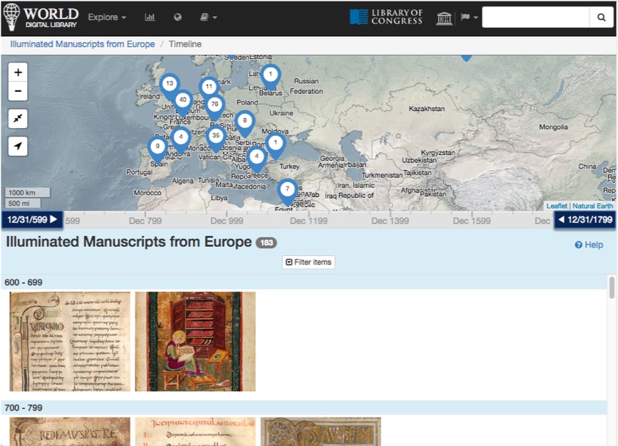


Visualizations using the timeline metaphor.
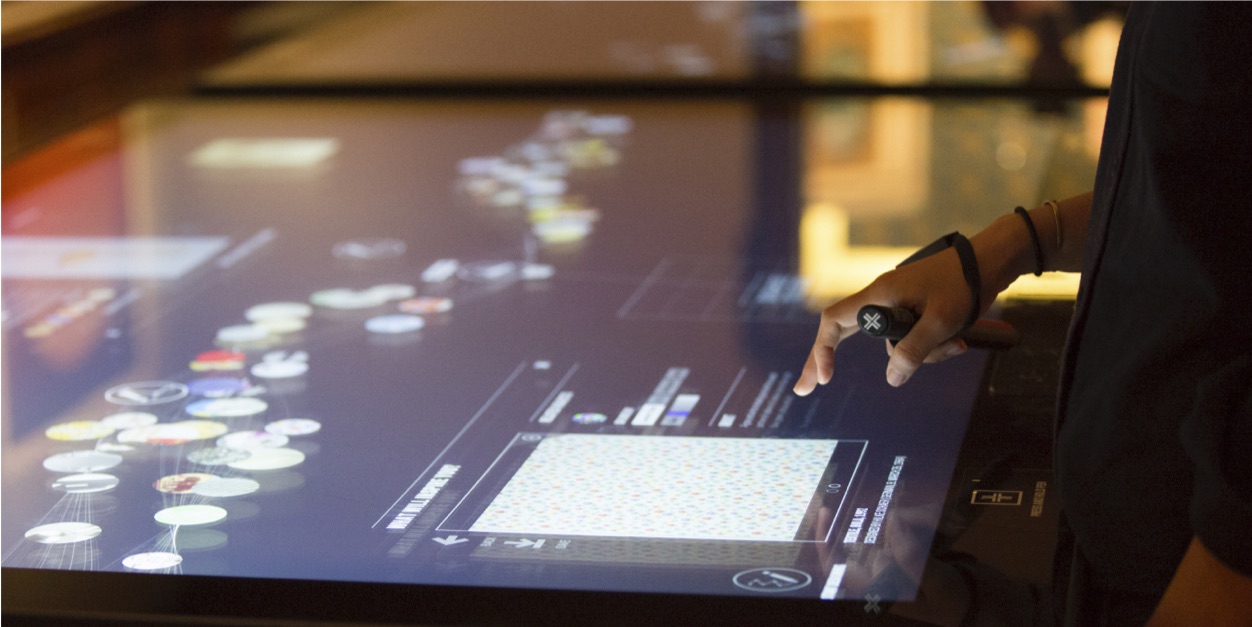
Two issues with the use timelines to visualize the collections from the Network of Libraries were that the data is sparsely populated, and that some items could cover a very wide time range, for example 50 years or even more. So the problem became how to handle such a large interval properly in a traditional timeline? Because of this issue, we looked into more dynamic approaches. The interactive timelines in the New Cooper Hewitt Experience at the Smithsonian Cooper Hewitt Museum in New York:

and the Timeline of Modern Art at Tate Modern in London:

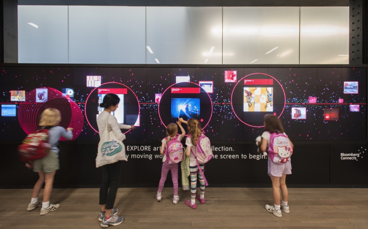

are great examples where museum’s collections are form a flowing stream where visitors can select and manipulate the items they find interesting.
Seach processes
Another concept that we considered early on was that of serendipitous search, as suggested by the following picture of a library user browsing the shelves:

To us, this idea of serendipitous search resonated with Psychogeography, the term coined in the 1950s by the Situationists and denoting the “exploration of urban environments that emphasizes playfulness and drifting”. Can we transfer this practice into the visualization of cultural materials to create some kind of “Librageography” or “Bibliogeografía”, which prioritizes playful search? Some visual inspiration related to these concepts:

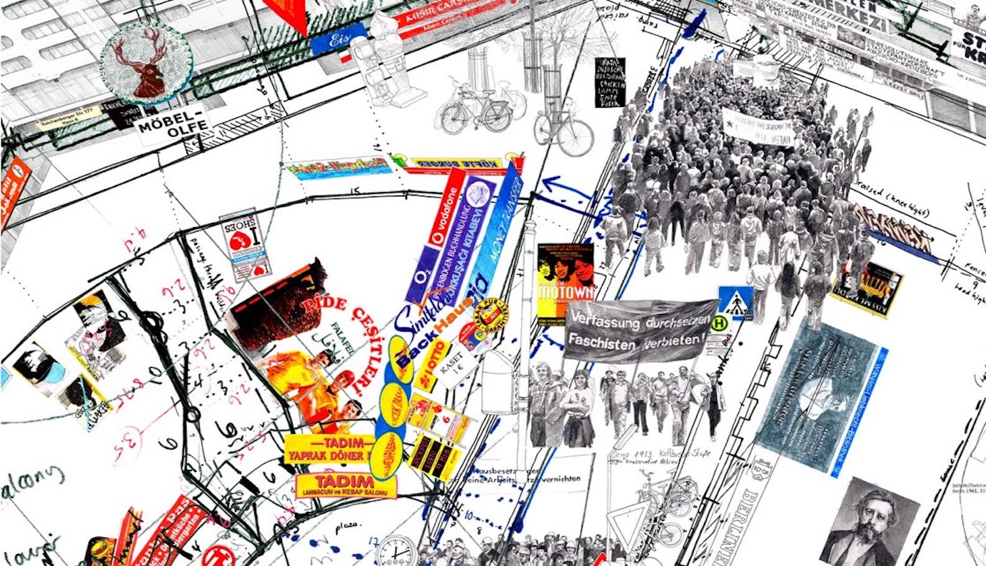
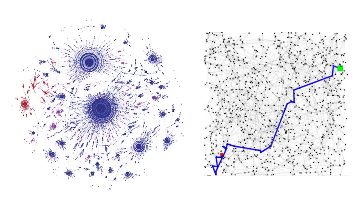
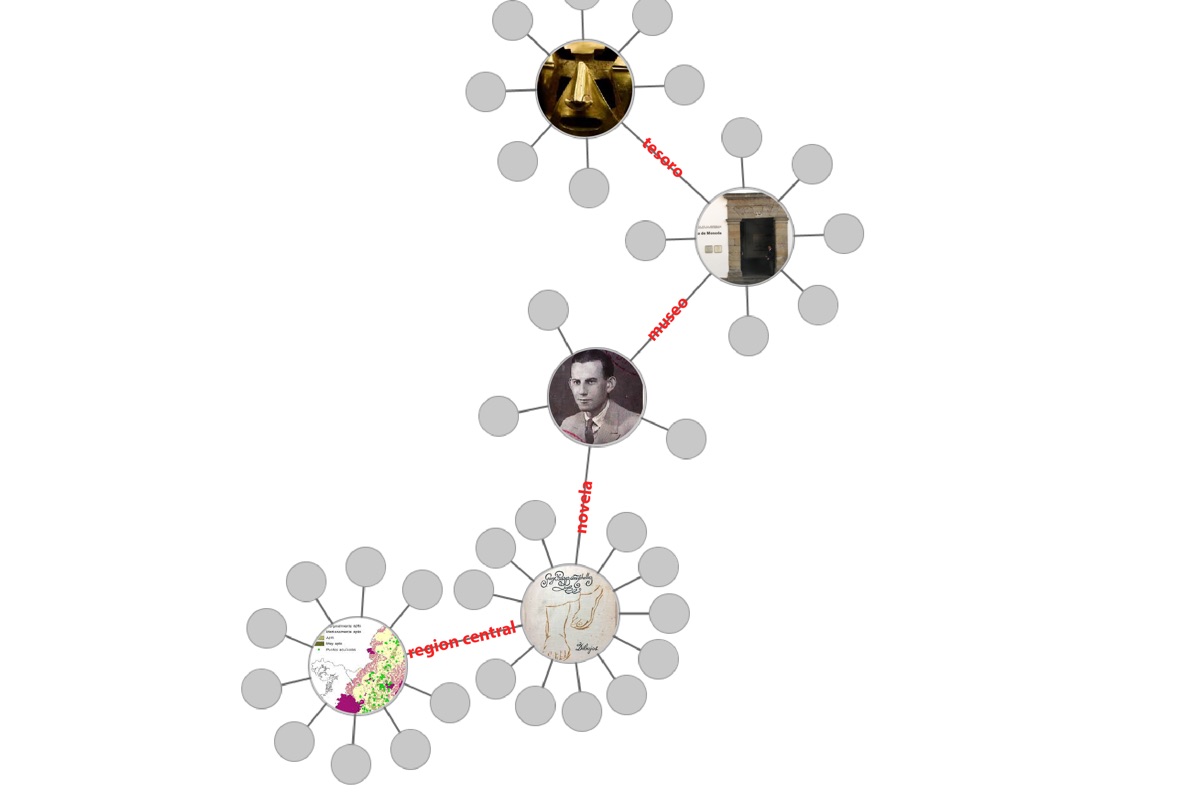
In particular, the psychogeographic concept of drifting led to the idea of a visual exploration where each user constructs their own map of the data by wandering through the connections between the data elements, defined by the common tags shared by the collections. The following early sketch offer a glimpse of these schemes:

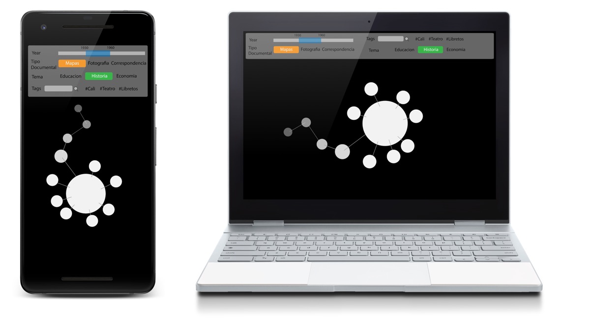
While a drifting navigation through the collections could provide an engaging and playful experience for ocassional users, the visualization should also offer tools for a more directed search that advanced users may need when researching the data or looking for specific information. A first mockup of the web viewer incorporates such tools:
Refining the design
Once we identified an initial visual metaphor and navigation mechanism, it was the time to start iterating over the early sketches while discussing the progress with the team from the Virtual Library of the Bank of the Republic, who was in charge of the project.


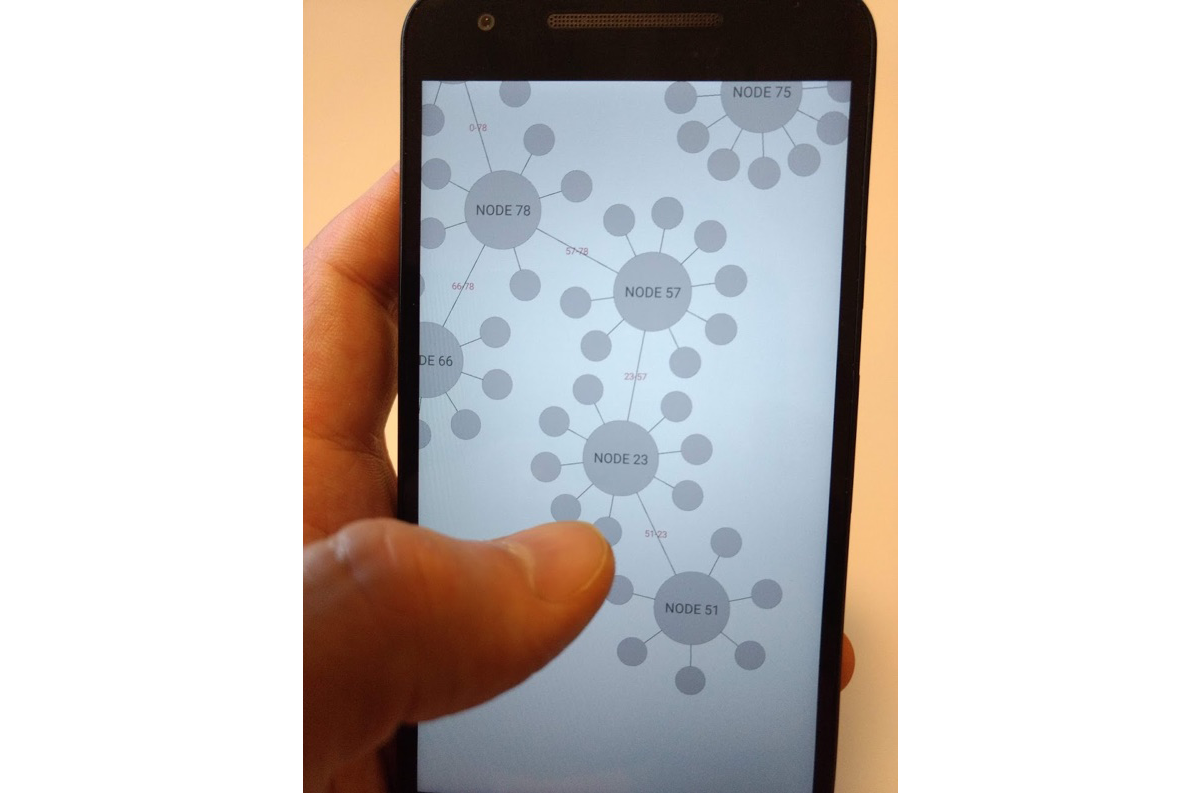
The prototype also supported mobile phones since the beginning, as it was very important that the web visualizer was accessible through both desktop and mobile:
In parallel to the design of the main visualization screen, we also starting sketching the intro screen. This is also very important, as the intro screen is the entry point to the visualization, and it may disuade users, specially newcomers, to stay in the page and explore the data:
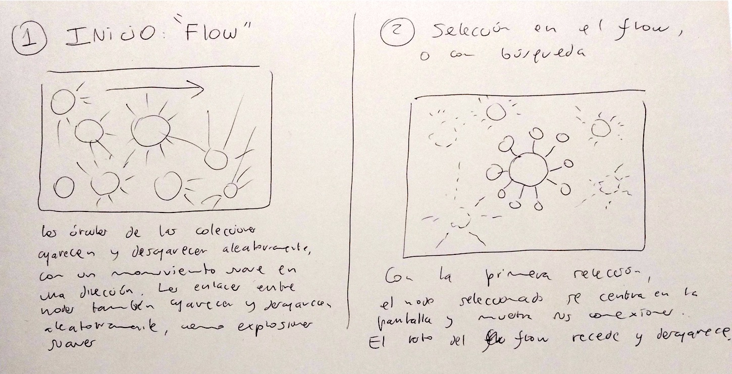
We developed a working prototype based on those initial designs and sketches, which allowed us to test the basic user flows and iterate the designs to obtain feedback quickly:
Once we agreed on the overall modes of introduction, presentation and interaction, we started refining the visual appareance of the prototype through color, textures, text, animation, and mutual relationships of all the elements:
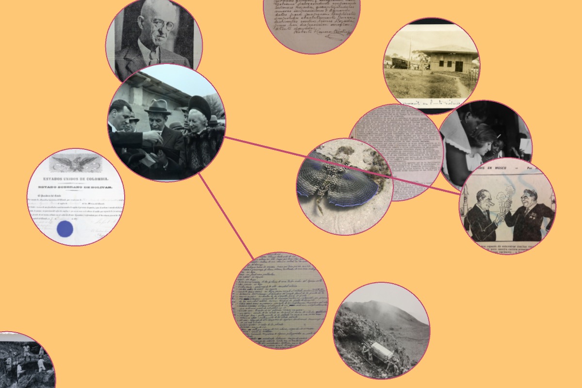
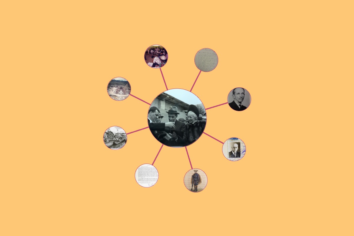


Work on the UI was also ongoing at this stage:


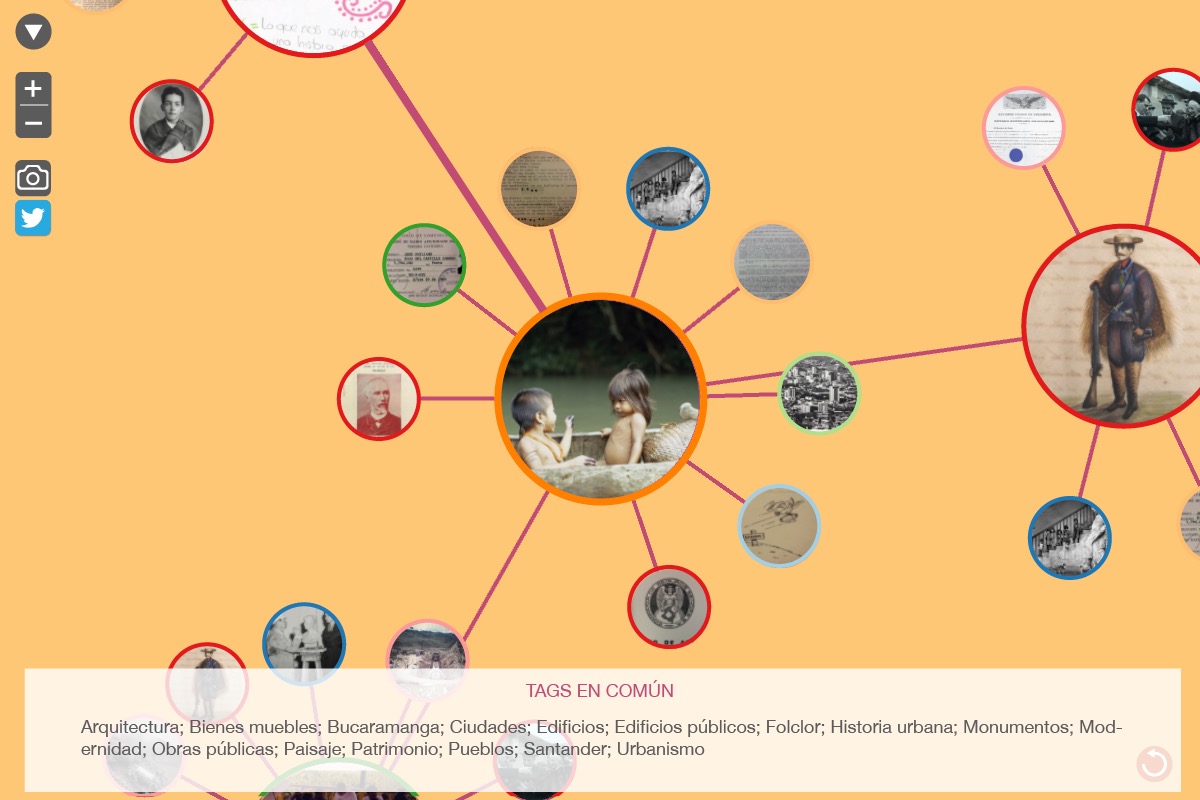
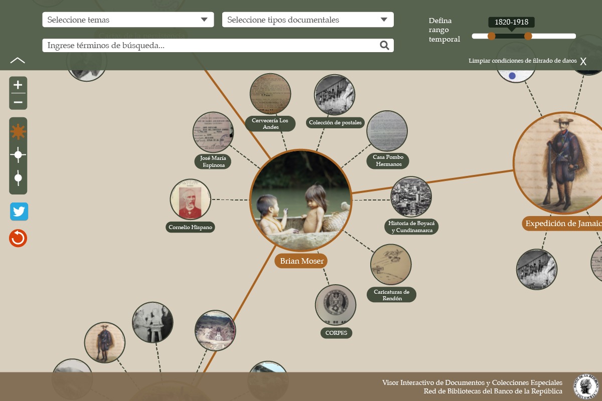
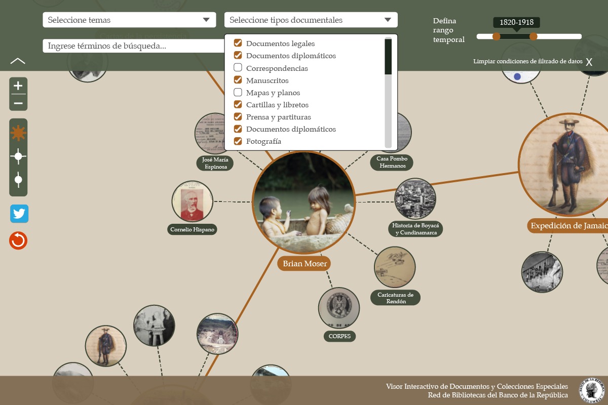
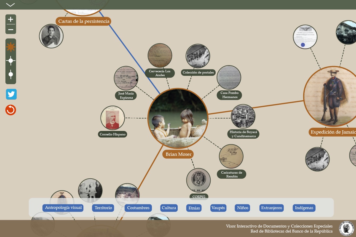
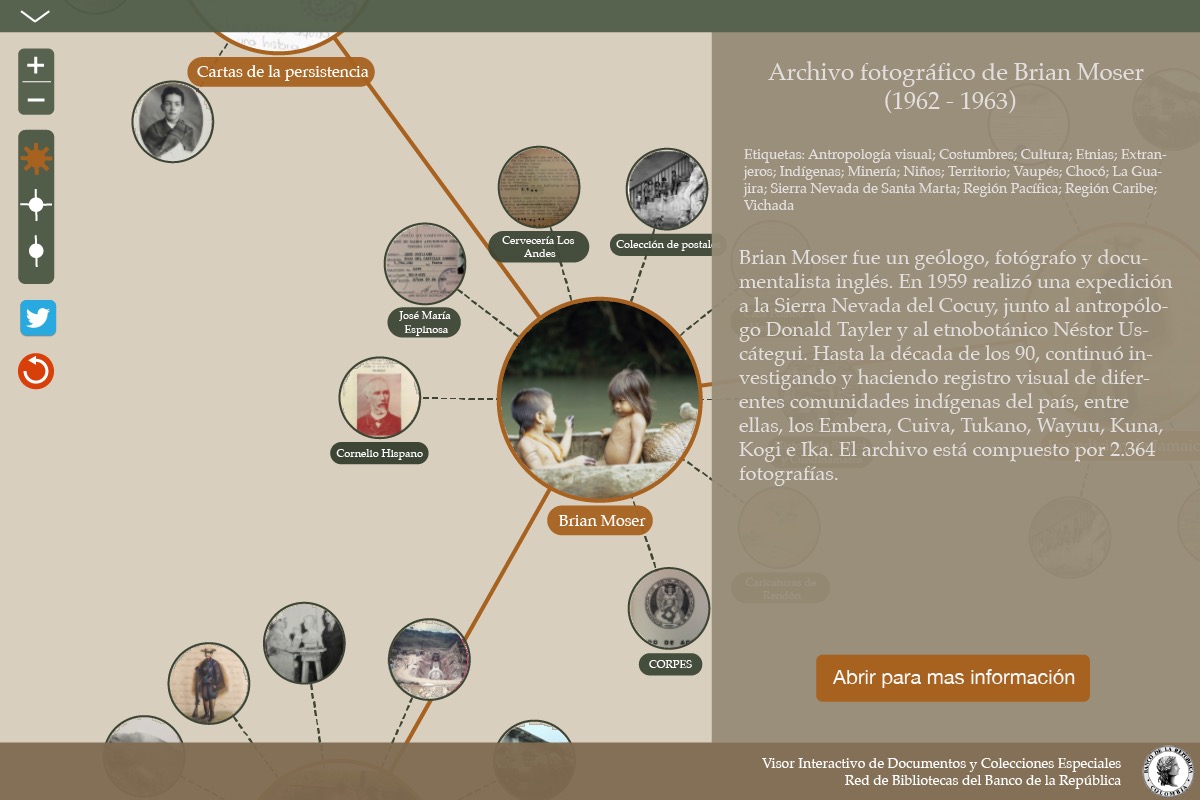
After a few rounds additional rounds of design iterations, the color palette and UI improved significantly, and at that stage we were approaching the final version, with only a few minor tweaks left:

Responsive design
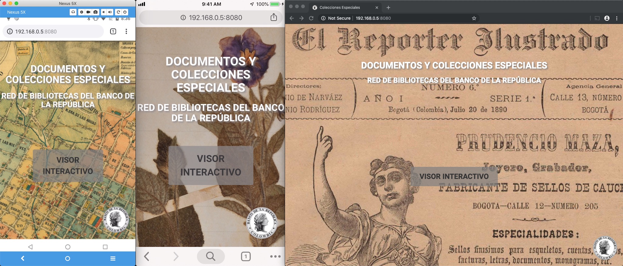
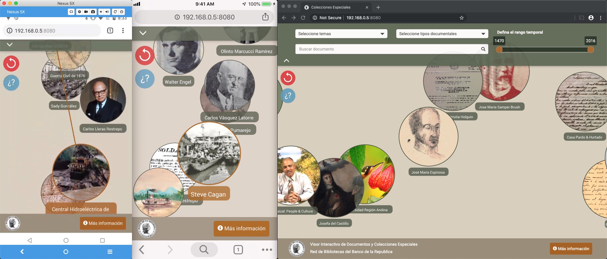
With a great majority of users navigating the web on their phones, a big priority for us was to ensure that the viewer worked well on mobile browsers. In the end, we were able to keep the functionality and appereance consistent across desktop, iOS, and Android, while dealing with the differences in screen state and interaction modalities (i.e.: touch vs mouse):

Conclusions
The Virtual Library of the Bank of the Republic released the new Special Documents and Collections portal, including the interactive viewer, in November of 2019. We are very satisfied with the design process described here as well as with the final product. We believe that we created an useful tool for cultural promotion and research in the humanities, and we hope to gain insight on the user engagement with the viewer based on the analytics collected by the portal.
comments powered by Disqus